Slow App Growth? More Features Aren’t The Answer
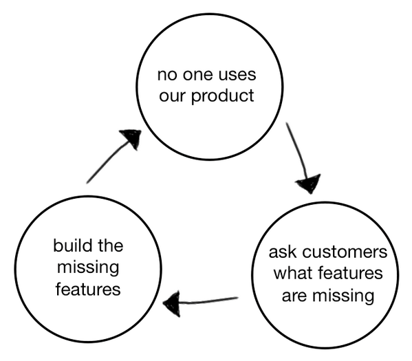
About a year ago, a management consultant from San Francisco named David Bland released this diagram he called the ‘Product Death Cycle’.
I was immediately struck by this diagram because it’s a cycle that is sadly common in the app development space.
Product/market fit is something we talk about all the time at Buzinga, as it’s always at the root of a lack of growth in a tech product.
“Tech companies die because of lack of customers, not lack of ability to build technology” – Steve Blank
See also: Key Features Of A Successful Tech Product
If you’ve been following our blog for a while now, you’ll know that great products and great ideas don’t get a golden ticket to success just because they are great.
There are hundreds of factors at play – is that great product being released at the right market timing? Is it backed by a marketing strategy that engages current and future users? Does it have the right team to drive it to scale and expand?
But with so many variables to account for, often the easy answer to a lack of growth is just to add new features.
New features = up to date technology= keeping it fresh and exciting=attracting new users!
Don’t get me wrong, sometimes adding more features is the answer to lack of growth. But other times, even if you listen to your users and ‘give the people what they want’, you still fail.
“The Product Death Cycle is tricky because it’s driven by the right intentions: Listen to customers and build what they want. But good intentions don’t translate to good traction.” – Andrew Chen, Silicon Valley insider
In this post I want to examine how startups can avoid the Product Death Cycle.
First we’ll take a closer look at the cycle and why it happens. Then we’ll look at the right questions to ask users to break out of it, or even better, how you can avoid not falling into it at all.
Phase 1. No one’s using your app
Source: Slideshare
Your app is fresh on the shelves and has no traction. You might have seen a peak in downloads within the first week, but now it’s stagnating.
Totally normal, don’t freak out!
Your natural plan of attack is to figure out the best way to react and secure steady growth in downloads.
Phase 2. Ask users what features are missing
Source: Dtmtool
Like any good customer-focused startup, you go straight to your users and ask them what the problem is.
The language you use is along the lines of “What features would you like to see in this app?” or “What would make you use this app more frequently, and for a longer time per session?”
Stop right there!
There are 3 things wrong with this approach.
1. Not relevant
Asking your existing users what features they’d like to see is probably not representative of the larger market of non-users who have never used your app.
Following their feedback to a T might engage your hardcore ‘power users’ who already love your app, but these features likely won’t engage the mainstream market.
2. How should they know?
“If I asked people what they wanted, they would have said faster horses” – Henry Ford.
I say that quote all the time, because it’s true. Your users are not product developers! They aren’t designers, or visionaries.
It’s the job of you and your developers to build an engaging product.
When getting user feedback for your app, if you give users a list of all possible features to put in your app and ask them which ones they want to see implemented, they will say all of them.
Of course they will! It’s a natural human reaction to want as many options and freedom as possible.
But studies have shown that users interact with less than 30% of features they said they would use.
And if you introduce all these spinning, whizzing features, few people will actually use them and they’ll cause the app to be cluttered and lose sight of its original product vision.
3. It might not be features
Asking someone what is missing in your app automatically implies that it’s missing features.
But there are so many more reasons why apps fail other than product-level failures.
If your app is bug-free, has intuitive user experience and perfectly solves the problem it was built for, your first port of call should be to investigate external market factors.
It’s easy to fall into a trap of short-sightedness and forget about the world your app lives in.
Features usually aren’t the root cause of problems – it’s something bigger.
Phase 3. Build the missing features
Source: Netizen online
The ‘next feature fallacy’ describes the way that developers desperately introduce new features, thinking that the next feature will make people want to use the entire product.
The reasoning behind this thinking is fundamentally flawed.
New data by mobile intelligence startup Quettra has shown that losing 80% of app users within the first 30 days is normal.
This means that the problem isn’t rooted in customer acquisition – it’s in user engagement.
Your users aren’t engaged enough with your product to spread word of mouth and recommendations, which is where long term growth comes from.
Building missing features that your currently engaged users want does not target non-engaged users. Sure, the 20% of users you’re left with at day 30 might like it (even that’s pushing it), but it isn’t going to attract and retain new users.
Most interaction with an app happens in the first few visits. If users are dropping off, that means there is a problem with the onboarding process.
Unless the new, missing feature adds value to the fundamental user experience, it won’t get used enough to have an impact on growth.
How to get out of the cycle
1. What’s your app’s core functionality?
Source: Thegospelcoalition
To get your head around what your app’s core functionality is, you need to start with your user personas.
We’ve written a lot about this before, so make sure you check out these resources:
5 Free Ways To User Test Your App
Get Crystal Clear On Your User
10 Most Popular User Feedback Tools For Mobile Apps
Your users personas are fictional people who use your app, each with different behavioural traits. You should do at least 3.
By mapping out your user personas you’ll dig deep into what the user’s needs are, not what they think they need.
The classic example of this is a customer coming to a hardware store saying “I need a hammer”. After 30 minutes of searching, you find out what they actually meant was “I want to hang a picture”.
The difference is subtle, but keeping this in mind allows you to think of your app less as a combination of individual features, and more as a solution to a problem.
Of course, features are a vital component to solving that problem. So how do you decide which should be implemented and which should not?
It helps to get visual and do a card sort with at least 20 real users.
- Write out all your app features on cards
- Have a user sort them in priority of what they would use the most to least. It MUST be in priority. You can’t have 2 top priority items.
- Mark down the results in a spreadsheet
- Add up the score for each feature according to rank for all users. If 5 users rank a feature at number 1, give that feature 1 point per person (5 in total). If 5 people rank it 4th most important it’s 5 x 4 points (20 in total).
So, the least popular features will have much higher scores and vice versa.
Now that you know what features people like the most, take the bottom half and throw them out.
Don’t put them in the app.
The reasoning is pure economics: Diminishing returns. Each feature takes time and money to implement, and since less people want to use the lower-ranked features, the more features you add after a certain point will be worth less and less.
That top half? That’s your minimum viable product (MVP).
The most famous example of an app that only succeeded in MVP form is Instagram.
It started out as Burbn, a FourSquare knockoff with tons of unique features. Despite $500,000 early funding, Burbn never really took off.
So, the founders cut everything from the app except for it’s photo, comment and like capabilities. What remained was Instagram!
Only once it gained traction and a loyal user base did Instagram roll out extra features like video, its monetisation model, and an ‘activity’ newsfeed.
All these added features have succeeded because they add value to the overall user experience, not just one part of it or to one user segment.
See also: How Instagram Became The Number 1 Photo App In 8 Hours
2. What insights can you get from user pathways?
Source: sjcgeelong
Analysing user pathways is essential to understanding which features you can add that will actually drive growth.
User pathways will uncover where users are dropping off, what screens they’re spending most time on, what app journeys they take, and what the average session time is.
Using app analytics to gather these insights will reveal what features will actually improve the UX.
Does this missing feature that users are requesting exist high enough up ‘the funnel’, so it impacts the parts of the average session with the biggest gaps? ie: the parts where users are ‘leaking’ through?
Or is it just an extra flashy feature that only 5% of your users will say ‘wow, I really needed this’, at the tail end of the core functionality?
The best features are in the onboarding
The features that drive growth will be the one that maximise the reach of your app, and therefore target non-users and casual users. This is a much bigger market to go after than your power users.
Consider what features you can integrate to optimise the first 5 screens, the onboarding experience, and the first product experience in general.
For example, if social connections are integral to your app, you should prompt people to add their friends as part of the onboarding process. Or if content is key (like a media app), you need to immediately ask people to indicate their interests.
This way, their first product experience will be engaging enough to make them a repeat user.
Features that aren’t often used (ones that are optional) will not bend the curve.
One of the best added features that is now commonplace in apps is Facebook login.
Many apps that required initial registration (and continual login) with email, name, and other details were seeing massive exit rates when users were prompted to leave their details in a sign up form.
Integrating the Facebook Login API cuts a 2-5 step process into just 1 tap. This significantly streamlined the onboarding process and improved conversions.
Trip Advisor saw a 27% increase in conversions and more than doubled their acquisition of new users by allowing people to quickly log in using Facebook across multiple devices.
It also makes Facebook sharing within the app a much more seamless process.
If the app user is already logged in using Facebook, they’re much more easily able to share their app purchase or activity when prompted. This helps spread word of mouth and awareness.
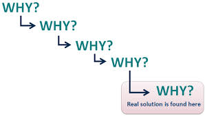
3. Have you asked ‘why’ 5 times?
Source: Leanblitxconsulting
The iterative 5 Why process is the best way to explore the cause and effect relationships underlying a problem.
You start with the problem statement and repeat the question ‘why’ 5 times. Each ‘why’ forms the basis for the next question.
Here’s an example:
Problem statement: The vehicle will not start.
- Why? – The battery is dead.
- Why? – The alternator is not functioning.
- Why? – The alternator belt has broken.
- Why? – The alternator belt was well beyond its useful service life and not replaced.
- Why? – The vehicle was not maintained according to the recommended service schedule.
By the time you get to the 5th why, you’ll have reached a statement (the root cause) that you and your team can take action on.
This is one of the most important aspects in the 5 Why approach – the real root cause should point toward a process that is not working well or does not exist.
It won’t be an answer like ‘not enough time’ or ‘not enough investment’, it will be a process failure.
What is the bottleneck caused by?
If you already have high retention from existing users, but aren’t getting any new users, your problem is probably to do with awareness marketing.
If you have low retention but new users are coming in droves, you’ve either got a product problem or an engagement problem. You may need to work on loyalty and UX.
Or it might be a strategy problem – should your app’s core functionality be revisited to target high-end or low-end users? How does this effect pricing, positioning and partnerships?
Would social integration actually prompt users to share updates through the app and drive word of mouth? Or is it more of a utility app, not a networking one?
It can help to strip your product back to the bare minumum functionality – if it bores you just thinking about it, that’s a good place to start!
This will force you to tailor your solution to the root process problem, not just ‘build more product’.
4. How can you reach product/market fit faster?
Source: YourHyphen
When developing your app, not every feature needs to be totally unique.
Your app probably has a few major competitors already.
Identify what they do really well, and why they are so successful. Then keep the fundamentals of their offering the same (about 80%) and substantially reinvent the remaining 20% in some way.
What ways can you do this?
You can go for the cheaper, better, faster option – Uber is the same offering as taxis but cheaper and faster, and Apple Music is the same offering as Spotify but better because it has a bigger music library.
Or you can go the niche route – The same offering as a competitor, but more targeted to a small group within the wider market based on demographics or psychographics.
For example, Yik Yak is the same group-based messaging service as Facebook Messenger, but targeted exclusively to university campuses and with the added feature of anonymity.
These 2 things are literally the only features that makes Yik Yak unique, and yet the app has taken off.
Of course, if your app is revolutionary and you don’t want to clone any part of someone else’s product, that’s a conscious choice and could lead to a long term strategic advantage.
Just keep in mind that if you need to educate customers on how to use your product (as is the case in any new market), you may not see a profit for several years.
But if you want to reach that elusive product/market fit as soon as possible, your app’s first version should be intuitive enough that users know what to do when they first open it.
If it’s too hard and confusing to use, they won’t open it again.
I hope these tips have given you insights into how you can think ‘big picture’ about your app growth.
Don’t just chuck in features and hope for the best – you’ll be waiting a long time.
Latest posts by Logan Merrick (see all)
- Ep 18: Collective Campus’ CEO on Intrapreneurship and Corporate Innovation - December 20, 2016
- 50 User Engagement Strategies For Planning Memorable Mobile Experiences - December 19, 2016
- Latest Data: App Monetisation Trends And Drivers 2015-2020 - November 25, 2016


