User Experience Design: 7 Steps To Making The App User The Hero Of Their Own Experience
Introducing Ross Gillespie, Lead Product Designer.
Every product has a story. It might not be a good story… but it still has a story.
Mobile apps are no exception.
Stories are what humans have been using to communicate since as long as we can remember. It just feels right.
Everything has a beginning, a middle and an end. But it is how the story is crafted that will make your app a memorable one rather than a forgettable one.
If you can make your user feel like the hero of a story, they’ll want to come back again and again to relive the experience.
For a mobile app user, feeling like a hero can be as simple as ordering food from their phone and getting takeaway.
In doing so, they have provided for their family. They are a hero.
“A flawless user experience is no longer a point of differentiation for an app – it’s a minimum expectation”. – Forrester Consulting Report, August 2015
This means that if your mobile app doesn’t deliver a user experience that makes people feel like a hero, they will quickly drop off and move on the next app.
So, how do you make your users feel like the hero?
It’s the difference between just handing them the solution, and building your story using anticipation and climax.
Donna Lichaw, author of “The User’s Journey”, does a fantastic job of describing the main ‘plot points’ all users should go through when using products like websites and mobile apps.
Here are 7 points for designing a user experience that will turn your user into the hero of your app’s story.
To give you more context, I’m going to illustrate these using Uber as an example.
-
Exposition
The Hero Is Introduced In His Ordinary World
Your user is the hero. Where are they? When are they in this situation?
It’s important to understand where your user begins their journey, their needs and wants at this time.
This will allow for intuitive product design that fits with what they’re already experiencing.
Uber example: It’s been a long week. Joe is out with his friends letting loose on a Friday night.
2. Incident
The call To Adventure
What makes the hero choose your app or make an action on your app?
It’s crucial to understand the ‘why’.
If the hero wants to book a cab, have a big button on the first screen: “Book Cab”. Get them to their goal!
Uber example: It’s getting late and Joe wants to head on home. He jumps onto his phone and opens up Uber, a personal driver companion app.
3. Rising Action
The Hero Encounters Tests And Helpers
Build anticipation for your user before they reach their goal.
This will make the reward that much sweeter. Browsing through online shopping websites and always wondering, ‘what lies on the next page?’ is a great example of this.
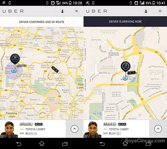
Uber example: After Joe books a ride home, he can see the driver appear on the map. He waits anxiously watching the driver get closer and closer to his location.
4. Crisis
The Hero Endures The Supreme Ordeal
This is the crisis moment. It’s good to be aware of the points (or screens) where users may find difficulty with your product and fall off.
This allows you to prepare and mitigate the risk of this happening.
Think of the worst possible scenario happening while someone is using your app, even if the likelihood of it happening are a million to one.
What contingency plans can you put in place to negate this?
Uber example: What would happen if the driver got lost or received a flat tyre before arriving? Uber has put in place a credit feature that allows users free rides. This keeps customers coming back even if they have had a bad experience.
5. Climax
The Hero Seizes The Sword
This is the reward the user has come to your product for.
Make sure they feel like the hero when they achieve this.
This is basic human psychology: If the user reaches the goal without feeling like they have achieved something, they will eventually stop trying to reach the goal.
This may manifest in them choosing a competitor’s product or an alternative solution to his problem.
Uber example: Joe has made it home! Better yet, he isn’t fumbling through his wallet looking for his debit card and making the end of the journey a pain. He walks away from his experience with the Uber app with the focus on the seamless end-to-end journey, not on the cost!
6. Falling Action
Resurrection
The hero’s journey is coming to an end.
Having a product that leads the user out of the climax will keep your users engaged and not left lost.
In UI design terms, this could be something as little as seeing a blip of animation appear after sending a message.
Uber example: Joe receives a notification shortly after he gets through his front door. A receipt appears with an invitation for Joe to review his driver. Joe is now home but still thinking of his journey with Uber.
7. End
Return With The Elixer
The user has reached the end of the story. Their experience with the product will influence how they choose to reach this goal in the future.
Obviously, a positive experience is more likely to result in the user returning.
Uber example: Joe’s first thought of his Uber experience was how easy everything was. All he had to do was ‘press a button’ and he was home.
By understanding your product’s story, you have a higher chance of connecting with your users, which in turn gives you a better chance at success.
When designing your app’s user experience, if you are conscious of the user’s journey and the path they take you will create a better product that people will enjoy using.
Give your app a story and a hero. If people feel the hero, they’ll come back again and again.
Wait up! Don’t miss the must-read guide that helped a startup sell for $12 million…
Ross Gillespie
Latest posts by Ross Gillespie (see all)
- 15 User Experience Design Tips For Building Lean, Profitable Mobile Apps - September 5, 2016
- UberEats VS Deliveroo: Which App Has The Best User Experience? - August 25, 2016
- User Experience Design: 7 Steps To Making The App User The Hero Of Their Own Experience - July 20, 2016


