Trailers Aren’t Just For Movies: 8 App Trailers You Can’t Stop Watching
This post is part 4 in a 5 part series on App Store Optimisation (ASO), which will show you proven strategies to make your app rank higher in app store search and get discovered!
Click the links for the next posts in the series:
Part 1: How To Pick The Perfect App Name
Part 2: How To Rank #1 On The App Store
Part 3: How To Hack App Store Search
Part 5: Infographic: 9 Ongoing App Visibility Tactics You Can Implement Today
A few weeks ago I gushed about how powerful a conversion tool videos are for app developers.
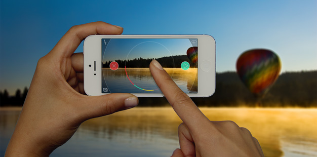
Apple and Google now allow developers to upload short ‘app preview’ videos to their app stores to accompany screenshots.
These videos act almost like creative app trailers for your app, and boost your app store rankings because people are much more likely to click that exciting play button than view a static image.
But these videos aren’t just great for app store optimisation.
They’re ideal to have as marketing collateral to generate awareness and promote your brand. Here are some possible uses to squeeze the most value from your app video:
- Upload to YouTube and Vimeo
- Embed on your website
- Share on social media as a ‘teaser’ before launch
- Send as a link to bloggers and publications who might be interested in reviewing your app
- Send to your email list with a link to download from the app store
- Use as an educational tool for new users
For paid apps in particular, a video offers potential customers an insight into the user experience, making them more inclined to spend their cash on a download.
Check out these 8 creative, funny and compelling app ‘trailers’ to serve as inspiration when you are creating your own.
1. Tiny Wings 2
Why it works: It’s creative and makes you think outside the box. Granted, only an app as well known as Tiny Wings could release a video like this for their second version. A lesser-known app would sacrifice some insight into the user experience.
Why it works: This beautiful app is packed full of features, and the video does an impressive job of condensing them into a short trailer without overwhelming the user.
Why it works: Perfect use of music, with actions timed to accent different music points for added punch.
4. Cambush
Why it works: The key ingredients for a viral video – An element of surprise with a dash of humour.
5. Starwalk 2
Why it works: Compelling design paired with an understated soundtrack makes this app look refreshingly minimal. It knows its target audience and communicates a clear positioning.
6. Hatch
Why it works: Using live action in app trailers is obviously more expensive than simply using animation, but when executed well (like in this example) it conveys user benefits much more persuasively than in-app experiences could.
Why it works: This is a great example of experiential advertising. It takes a relatively mundane app and makes it exciting by focusing on the events it caters for, rather than app functions. This shifts consumer associations from ones of productivity (pretty underwhelming) to ones of experiences.
Why it works: With an app as beautifully designed as Monument Valley, it’s hard to go wrong with an in-app video.
You can see from these examples that industry is no barrier when creating an engaging (and converting) app video.
Each of these previews harnesses music, animation or story to drive app store browsers to their app page.
From here, it’s a hop and a skip to the ‘install’ button!
Where to go next…
Part 5: Infographic: 9 App Visibility Tactics You Can Implement Today
Latest posts by Leah Godden (see all)
- 5 Concrete Ways To Slash Your Mobile App Marketing Costs by 100% - March 24, 2016
- Content Marketing Strategy For Apps: A Quick And Dirty Guide - December 17, 2015
- 6 Proven Ways To Make Your Push Notifications Irresistible To Open - September 10, 2015


