5 No-Cost Ways To User Test Your App
The famous architect Frank Lloyd Wright once said “Fix it on the drafting board with an eraser, or the construction site with a sledgehammer”.
The same concept is true in digital products. And that’s why testing your app concept with real life users as early and often as possible will help you create the best possible app you can.
Why Do I Need To Do User Testing?
Source: Limina
I realised the importance of formal user testing when I was studying at Uni.
I was part of a team of 12 students that had created a small segment of a fully functioning game for the Xbox 360.
We decided to exhibit it at the Armageddon Expo here in Melbourne. (Armageddon is a comic book and pop culture expo with more than 60,000 attendees)
2 hours and 40 eight year old gamers later our dream had been thoroughly crushed.
Everyone who tried our game hated it because they didn’t understand what was going on and, more importantly, how to interact with what was going on.
So the next day we started observing exactly what people were trying to do and noting down what was stopping them from achieving those goals.
We went back to the drawing board with the results and a few weeks later presented a new version to another group of people.
It was great. They got it. They loved it.
But like Frank Lloyd Wright’s quote, we had to use the sledgehammer to fix the problem.
If we knew earlier we would have only needed an eraser.
Luckily there are some handy ways to find out how your potential users understand your product (or potential product), and how they’ll want to interact with it.
Consequently, this is also a great way of zeroing in on your M.V.P by removing personal bias about features and requirements.
Things To Remember Before You Start
Source: Whole Hearted Men
- Leave your ego at the door. The blunt truth is actually the best feedback you can get.
- Fix problems and don’t be precious how you do it. Many of us jump straight to an overly complex or fancy solution and stick to it without truly understanding the problem we’re solving.
We don’t need fancy, we need the problem solved – And the best way to uncover the details of that problem is to observe users.
In the app world Uber is an awesome example of this. It solves the problem of “I need to get to work/a friends house/the airport” not “I need a taxi”
- You’re observing behaviour, not getting opinions.
Asking users what they think they think often leads to unintentional biases.
The goal of user testing is to see if people understand what they’re doing, and if your app is behaving the way they expect them to.
OK let’s get started.
1. Personas
Source: Interaction Design
So, you want more than a couple of downloads for your app, right?
Of course you do. But to achieve this we need to understand more about people that aren’t YOU.
Your users think about things differently and behave differently to you, your business partner or your mum.
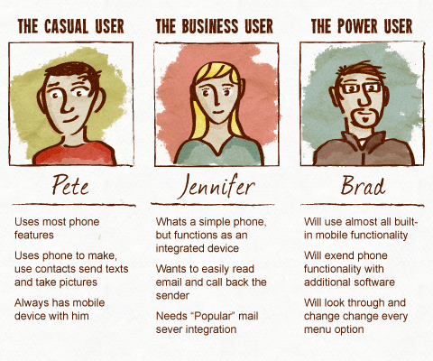
The easiest way to take this into account is to create personas. These are fictional people who will be using your app.
I usually do at least 3 to help us get an idea of what our core functionality truly is.
- Start by giving them a name and even draw a picture of them.
- Then fill in some information about them such as their needs: “I want a Hammer” and their problem: “I need to hang a picture”.
- Add any beliefs and habits they may have and what they are currently using to solve their problem.
- Start to familiarise yourself with this person and list out what type of features they may want.
I start with the Power User: The person who will use every single feature in your app and know it inside out. The other users I map out are ‘Average Joe’ and the ‘Casual’.
- Power Users – Will want to use every single feature in your app and know it inside out.
However, catering to their every whim will make your app bloated and confusing.
This is a classic example of opinions not reflecting observations.
If you ask users (and clients) which features they want, they’ll usually say they want everything.
But studies have shown that, when actually observed, users interact with less than 30% of features they said they would use.
Moral of the story?
Try not to ruin your core functionality by introducing features that only the few hardcore users want.
Essentially ‘lots of features’ is the mortal enemy of ‘easy to use’.
- Casuals – could make up a lot of your initial downloads, but they tend to use it infrequently and drop off. They will basically only use the central function.
- Average Joes – will use the central function plus a few other features within your app. These are the users you should focus most of your attention on, because they represents the vast majority of your users. (ie: your cash base!)
So basically, anything that the Casual or Power User introduce to the system that has a negative impact on Average Joe you should be very suspicious of.
I know this sounds a little odd, but the more you think of these imaginary friends as people, the less inclined you’ll be to add features and processes that would annoy them.
Relevant content: App Marketing: Get crystal clear on your users
2. Red Routes
Source: Cheshirefire
This is something you can do with friends and family without too much bias, unlike prototype testing where you need strangers to give feedback.
- Write out all your app features on cards (I use the old system cards from a newsagent or Officeworks).
- Have a user sort them in priority of what they would use the most to least. It MUST be in priority. You can’t have 2 top priority items.
- Mark down the results in a spreadsheet, then rinse and repeat with a new person. Do this with at least 10 people, although 15 to 20 will get better results.
- Add up the score for each feature according to rank for all users. If 5 users rank a feature at number 1, give that feature 1 point per person (5 in total). If 5 people rank it 4th most important it’s 5 x 4 points (20 in total).
Obviously, the least popular features will have much higher scores and vice versa.
By arranging your features according to users’ preferences (not your own), you’ll shed some light on which features will get most traction.
Bonus Tip:
I’d normally recommend you halve the field and throw the bottom half out.
Don’t put them in the app.
The reasoning is pure economics: Each feature takes time and money to implement, and since less people want to use the lower ranked features, you’ll get diminishing returns.
That top half? That’s your MVP.
3. Card Sort
Source: The Cards of Life
Now that we know what features we should be prioritising, we can see how people understand this content.
Card sorting is similar to Red Routes in execution, but different in intent.
The aim of a card sort is to group functions and features together.
This is especially handy for things that have many categories and items, such as job types in Seek or shoes in an online store app.
Using the shoe example:
- Create a card for each pair of shoes in your app (or a large selection)
- Write information on each card such as size, colour, price, style and brand
- Get users to group cards together in whatever way they like
Similar to the Red Routes, you will start to see a pattern emerge.
This is very dependent on the type of app you’re building. If it’s just for work boots, users may group shoes by size and price. High end womens shoes? Possibly sorted by brand and style.
One thing to consider with this type of test is that the results may not match your business goals.
Keep an eye out for this and find workarounds.
I once did a ‘card sort’ of movie screening times. What we found was that most people wanted to know about their local cinema first, then what time slot, then what film. This makes sense when you consider the first 2 factors revolve around highest personal convenience.
But you’ll notice most cinema web sites don’t match this format. Instead it’s usually film first. This is because movie distributors want to promote certain movies over others.
The workaround is often a filter option to narrow down results to cinema.
A final version of card sorting is where you provide preset categories for content. This usually takes the form of menu headings and users can fill in what they think should go under that heading.
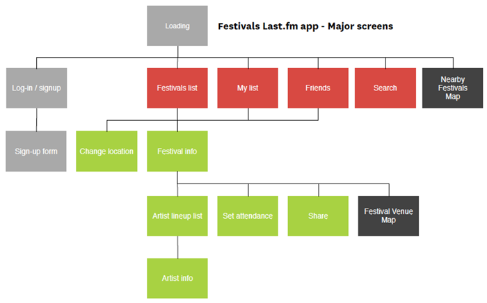
4. User Flow
The return of our personas!
For this task we map out (step by step) – the exact actions we think each persona would carry out to achieve their goals, preferably our highest priority tasks.
Mark out where in the process is the most painful for a user, and where we think they’re most likely to leave or get confused.
By doing this we can see if some features impact on others.
Here’s an example for the Festival Finder app:
Source: Graham Todman
By creating a user flow, we can uncover valuable insights. For example: Are we introducing a painful login process when it is only used for a ‘Power User’ task?
Throw it out and make everyone else’s experience better.
5. Competitor Analysis
Source: Cygnis Media
This task is the same as a normal user test, but instead we look at a competitor’s product. We do this so we can see both what features people love and understand but also what things irritate them.
A thing to consider here is that some pain points are unavoidable. If a sign up process annoys people in another app it’s probably going to annoy people in yours.
The process is to give the app to a friend who has not used it before, and quietly observe them.
Give them a few tasks but keep the tasks vague.
Avoid “Buy a pair of black size 6 leather Brand X boots”. Instead aim for “Buy some shoes for a wedding next week”.
While they’re completing these tasks get them to vocalise any confusion or delight in the process.
If they seem confused ask them what they’re thinking. Always use open questions.
A Final Note…
All of these tasks can be done with friends and family with only a little bias.
Many other methods can be used but it’s best for them to be carried out by a third party to ensure they’re performed correctly and the data isn’t influenced in any way.
Testing your idea can be an ominous experience. You have to be ready for the knocks and criticisms.
But if done properly it can yield amazing insights into your app idea and help make it the absolute best it can be.
Because there are few things as depressing as an 8 year old telling you your work is shit and being right.
Related Articles:
- 5 Ways To Get Real Users To Test Your App
- Mobile App Testing: Improving Functionality and User Experience
- The Definitive Guide to Mobile App Testing
- 10 Most Popular User Feedback Tools For Mobile Apps
Latest posts by Ben Rejmer (see all)
- 5 No-Cost Ways To User Test Your App - June 18, 2015
- Part 3: 5 Important Approaches For Gamifying Mobile Apps - June 4, 2015
- Part 2: 4 Powerful Reward Strategies For Gamifying Mobile Apps - June 3, 2015

