How To NOT Annoy Users With Mobile App Advertising
As far as monetisation methods for apps go, mobile app advertising isn’t the most glamorous.
Mobile ads have a reputation for being annoying and potentially harmful to the user experience.
But this is an unfair assumption, spawned from lazy marketers who want to make a quick buck.
In-app advertising is actually the fastest growing sector of mobile advertising, yielding up to 20% more engagement and 2000% higher click through.
With a thoughtful approach, there is no reason why you can’t improve click through rate on your ads while being minimally intrusive to your precious users.
Here are 6 best practices for your mobile app advertising strategy:
Be relevant, be targeted
Source: Huffington Post
I’m really into talk-show style podcasts.
You know what I hate? When I get pop-up ads on my podcast app telling me to download the latest Dragon Slayer game.
We’ve all experienced that annoying feeling when we’re constantly being bombarded with ads that are of no interest to us.
The key to relevant advertising content is context.
Dive into your app analytics and data to get a clear idea of who your user is.
Armed with this data, you can develop user personas based on demographics and mobile behavior.
Then you can target users with location and content-relevant advertising.
Lets go back to my podcast app:
If they dived into my data, they would see that my subscription list mostly consists of podcasts in the ‘culture and current events’ category.
Knowing this, my app could target me with ads to subscribe to online magazines or news publications.
The Dragon Slayer ad could go to someone who listens to game review podcasts – I’m sure they would appreciate it more than me.
When done effectively, you’ll see a shorter drop-off rate caused by users exiting the app after being exposed to yet another irrelevant ad.
You’ll also reward your advertisers with higher conversions and click through rates.
Use opt-in videos
Mobile video is blowing up right now!
Video is a highly effective and engaging medium, with people over 85% more likely to purchase a product after watching.
Regardless, a video that plays automatically when you’re immersed in the app can be annoying to the user experience.
That’s why opt-in videos that reward users for watching an ad have a 30% higher click through rate than non opt-in ads.
Opt-in videos work because they respect the user enough to give them a choice.
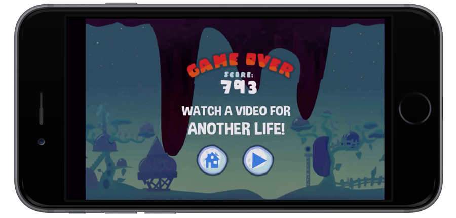
Picture this: A player is engaged in your gaming app, then their avatar dies (sad).
Instead of prompting them to play again, you prompt them with an option to get an extra life in exchange for watching a short ad.
Bonus tip: 92% of users prefer to choose the reward they receive, so give them a couple of options.
This is a much more rewarding advertising method for the user, and has the added benefit of keeping them engaged in the app for longer.
Try and keep them short – less than 15 seconds is ideal.
Check out this method in action with Pic Stitch, a photo collage app.
Source: Vungle
Don’t interrupt
Timing is essential to a pleasant advertising experience.
In-app ads should be non-intrusive and shown at natural pause points in the users’ session time.
Obviously, this will differ for different apps.
For games, the best time for displaying ads is between levels and after Game Over.
Source: App Annie
A bit of trial and error is necessary to optimise timing.
If you have a photo collage app like Pic Stitch, you might notice that your ads are getting most engagement at the end of a session time.
This could inform your choice to trigger ads when a user selects a tool for editing the final touches of their design.
This follows a wider trend of ads being shown as a user closes the app (postitial ads).
This is because they are guaranteed not to obstruct any part of the user experience.
Postitial ads can receive up to 5 times more engagement than interstitial advertising, which is scattered throughout an app session.
Don’t take any of these stats at face value, though!
Testing is the best way to get first-hand information on what your users prefer.
Don’t advertise too early
Source: Higgeldy Garden
A user won’t appreciate being welcomed to your app with an ad.
The first day or 2 after download are the make or break for users to decide if they want to be a regular user, or a drop off.
Because this is a sensitive time, I wouldn’t want to risk any aspect of the user experience (even if my ad was amazing).
Hold off on ads for the first few days of use after installation.
This should hopefully give them enough time to get hooked on your app.
Then (ideally) you can slowly roll out minimally intrusive, relevant ads.
Most app users realise that developers need to make money somehow, so they’re only going to get angry if you start abusing your privilege by spamming them.
Don’t do that.
Measure, monitor and improve
Source: Mobile Advertising Watch
Never stop testing!
One the biggest benefits of mobile advertising over other monetisation models is your access to data.
Tweak all aspects of the advertising experience to see what happens to engagement, such as:
- ad formats
- ad placements
- ad frequencies
- rewards
- ad timing
- Ad copy (font, text size, words, images)
Literally anything you can test, no matter how small, just do it.
But why should you bother testing things which seem irrelevant to what’s driving clicks?
The answer is that you never know what’s driving advertiser engagement until you test it. You aren’t the user, so don’t make any assumptions.
There’s a lot of weirdly fascinating psychology behind what drives us to make purchase decisions, and this is particularly evident on mobile.
App users have a short attention span, so you therefore only have a narrow window of time to grab their attention.
On a small mobile screen (yes, even the iPhone 6 Plus), it could be the tiniest alteration in the colour of the ‘download’ button that makes the difference between getting a click and exiting the app.
Don’t believe me?
Hubspot ran a test and found that red call-to-action buttons were 21% more likely to get clicked on than green ones.
Just make sure that you only test 1 variable at a time, otherwise when you see your click through rate increase, you won’t know if it was because you increased the size of the logo or because you sent it in the morning.
Finally, be patient! Wait at least a week after implementing the test to ensure your data is statistically significant.
Display engaging ads
It doesn’t matter how optimised you advertising is, if it doesn’t capture the attention of the user you won’t see a lot of clicks.
Follow the classic AIDA checklist.
Does the ad capture:
- Attention
- Interest
- Desire
- Action
There’s a lot of marketing clutter out there, and this is forcing advertisers to design ads that customers want to see.
The good news for mobile is that there is more room to be interactive and engaging than in more traditional advertising mediums.
It should be no surprise that rich media ads (video, gifs, games) perform better than standard display banners.
Razorfish has created some truly amazing in-app ads.
They’re more than just something to look at, but actually increase the utility of the app.
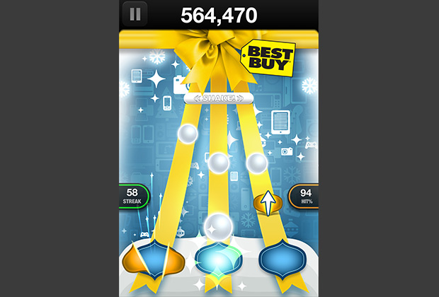
Their ad for Best Buy within the Tap Tap Revenge Tour app effectively made the ad part of the game.
A sponsored game in the same style as the app showed users what gifts they could buy for family members.
It was totally tailored to the user.
Source: Iab
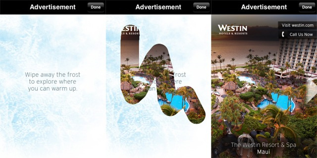
Here is another one of my favourite interactive ads from Razorfish, for Westin.
source: Mashable
There is no rule to say ads can’t be fun and playful, much like the apps that host them!
Mobile app advertising can be a lucrative source of revenue when executed well.
Your ads should be highly targeted, well timed and integrated into the user experience.
And above all, don’t be annoying!
At the end of the day, users will only click on ads that provide value to them.
Latest posts by Leah Godden (see all)
- 5 Concrete Ways To Slash Your Mobile App Marketing Costs by 100% - March 24, 2016
- Content Marketing Strategy For Apps: A Quick And Dirty Guide - December 17, 2015
- 6 Proven Ways To Make Your Push Notifications Irresistible To Open - September 10, 2015


